

Data Visualisation Competition - winners announced!
The topic of data visualisation has been hugely popular in our community in recent months – with hundreds of you taking part in events and discussions on everything from how to make visualisations more accessible, to technical discussions and the role data viz can play in holding governments accountable. Data viz is everywhere at the moment in The Data Lab Community!
So, to try and get more people involved in data visualisation, we launched our inaugural data visualisation competition in September, to coincide with the Community’s 2nd birthday.
Entrants were tasked with coming up with a visualisation on the theme of community. However, it was up to each person to decide on how they'd like to interpret the theme. We didn’t prescribe any specific techniques or platforms, nor did we require a specific dataset to be used.
Entrants were free to think about what community meant to them, which resulted in a fascinating array of entries from all over the world including France, India, Nigeria and Scotland!
Up for grabs for the 1st place winner was a ticket to Data Summit 2023, an opportunity to speak at the conference, and a £500 Amazon voucher. 2nd and 3rd place were also offered a ticket to Data Summit 2023.
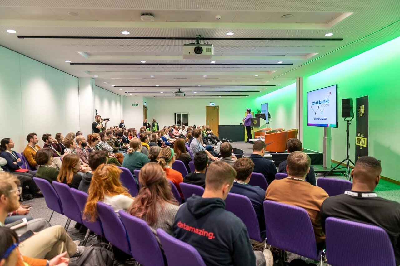
The winner of the competition was announced live at Data Summit 2023 to a packed room of data visualisation enthusiasts – there wasn’t a spare seat in the room!
A massive thank you to everyone who took part in the competition, and to our panel of judges Tricia Govindasamy, Mark Shilton, Reema Vadoliya and Irina Maria Mocan who had the difficult task of scoring each entry on four key criteria:
- Communication: Entries needed to be clear, concise, engaging and impactful, with creative and innovative visualisation concepts to communicate the competition’s theme.
- Design: The design of the visualisation needed to be visually appealing, easy to read and interpret, and was required to incorporate appropriate colours, fonts, and visual elements.
- Accessibility: Visualisations were required to be as inclusive as possible with accessibility in mind.
- Relevance to the theme
So, without further ado, here are this years Data Visualisation Competition winners!
3rd place winner: Mental Wellness Research Collaborations by Ifeanyi Idiaye (Nigeria)
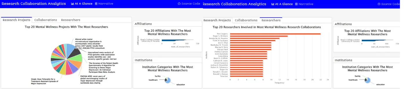
Here’s what Ifeanyi had to say about his visualisation:
The story I aim to convey through my visualisation is that community means collaboration and working towards a common goal. I have focused on the collaborative research efforts into aspect of mental health, namely depression, anxiety, and PTSD, because mental health is a problem plaguing many people and remains a serious menace to happiness and a healthy state of mind. Therefore, it gives hope knowing that there are so many ongoing collaborative research efforts to find a medical or psychiatric solution to mental health issues. That hope is what my visualisation attempts to share. My visualisation addresses the competition's theme of community because community can mean working together towards a common goal. That is precisely the message my visualisation conveys.
Judges comments:
“I have learned a lot from your initial exploration of the dataset on an interesting topic. Your passion for data and technical skills come through in this project. I encourage you to analyze the dataset further, adding more variables and highlights to your charts” - Irina Maria Mocan
“The narrative section of this submission took the reader on a journey through the charts and I enjoyed being led in this way. I felt like I learned something and had been told a story.” - Mark Shilton
“Mental health is an incredibly important topic and talking about how community in the researcher space is contributing to further action hits multiple components of the community definition” - Reema Vadoliya
2nd Place Winner: Galaxy of Voices by Florian Melki & Marthe Viallet (France)
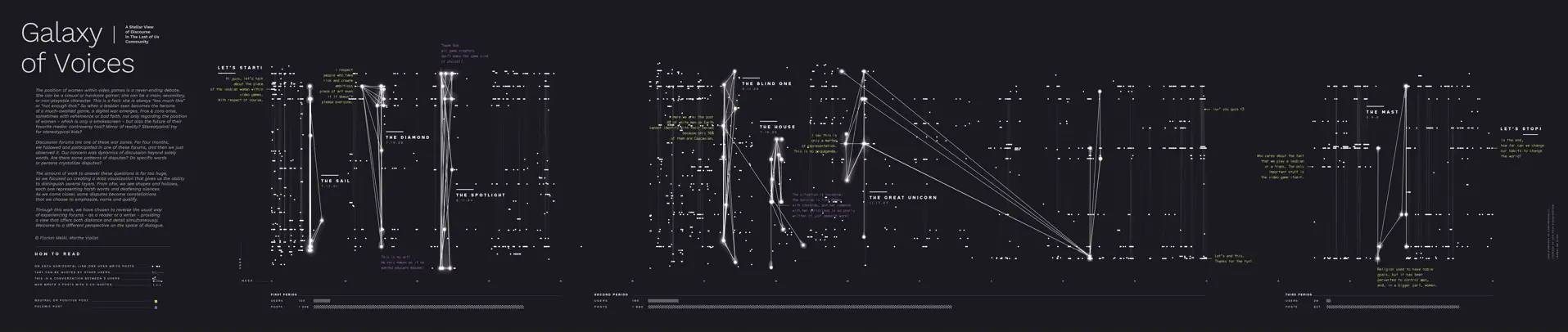
Download the full size visualisation here.
Here's what Florian and Marthe had to say about their visualisation:
When a lesbian teen is the heroin of a famous video game, this leads to 4 months of discussions and disputes within a discussion forum. With our data visualisation, we aim to show a new way to visit such a forum and to emphasize these disputes: not from the inside, but from the outside, with both distance and details. Our data visualisation addresses the competition's theme into two different levels: by showing how a community - the one of this specific discussion forum - is discussing about the representation of the LGBT community within video games.
Judges comments:
“The design is unique and creative working with the data! The branding is uniform throughout. The design compliments the title "Galaxy of Voices". - Tricia Govindasamy
“It's very clear to see how this overlaps with community. Not just in the space of online forum based community but also within the LGBTQ+ community looking into understanding inclusion within the specific game domain.” - Reema Vadoliya
“They took a really interesting tack on the theme of community. Not really telling the story of a community but zooming out and genuinly trying to visualise what a community having a debate on the internet 'looks' like using a network style visualisation with a time dimension.” - Mark Shilton
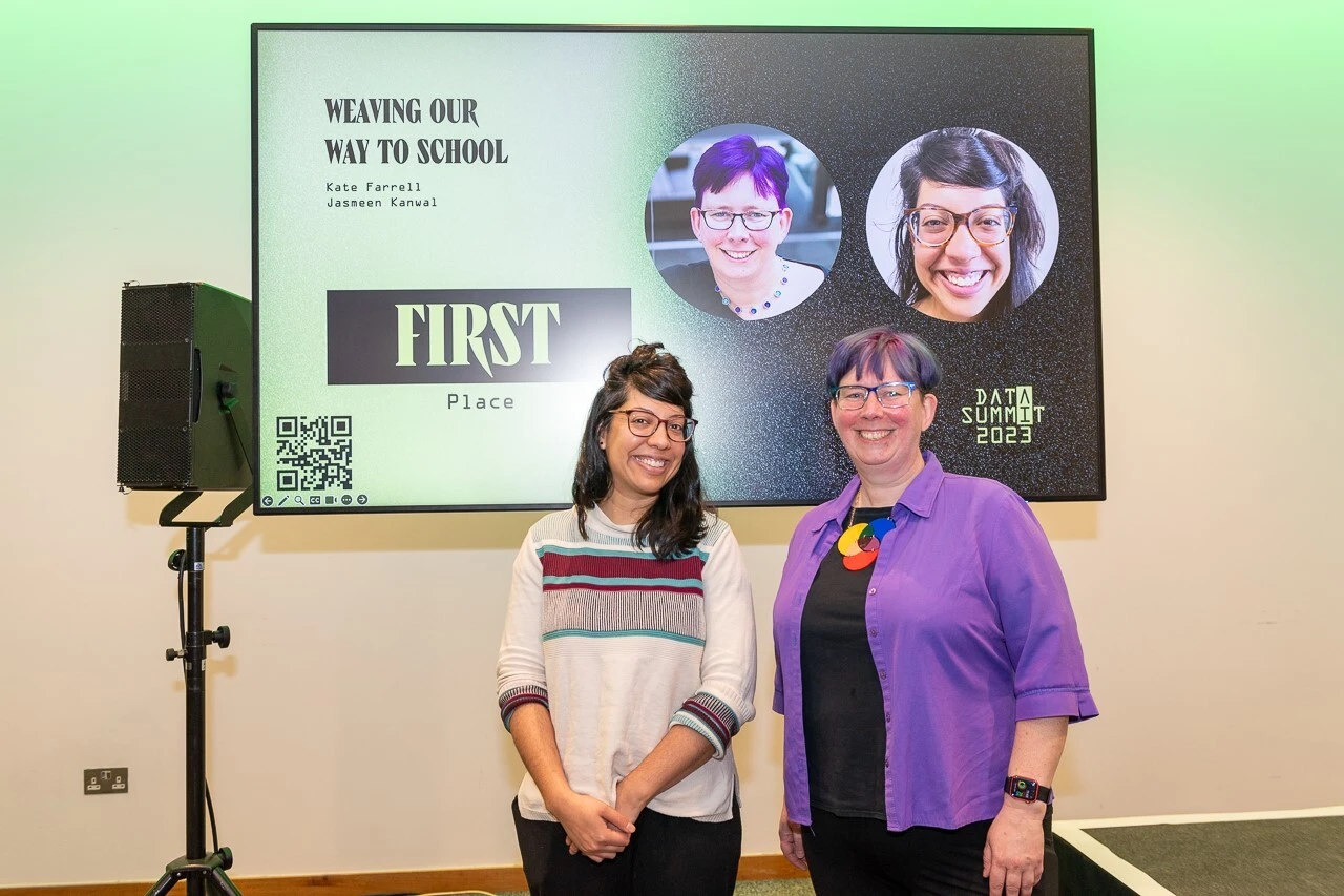
1st Place Winner: Weaving Out Way to School by Kate Farrell & Jasmeen Kanwal (Scotland)
Here's what Kate and Jasmeen had to say about their visualisation:
Data visualisations and data gathering can be 'unplugged', outdoors and fun. It can involve members of the community gathering and creating data visualisations as art installations, giving them agency and ownership. The issue of transport (and resulting air pollution) affects all members of the local community. We offered ribbons and the idea to a selection of Primary teachers. Many of them involved the whole school in the activity and other members of their school communities. Some went on to gather more data on other topics on the school fences, gathering data from learners, family members and community members.
Judges comments:
“A unique concept of "DARTA" aka Data Art. The involvement of weaving bright coloured ribbons outdoors is fantastic.” - Tricia Govindasamy
“The design of this project immediately lends itself to demonstrating how community is involved in this visualisation. Any project that gets people excited about data is a win from me. It's such a brilliant way to get so many members of the education community involved in the importance of and use of data as a storytelling means. “ - Reema Vadoliya
“The entry most directly rooted in the communities that the visualisation is about. Everything about this entry screams 'commnity'” - Mark Shilton
Once again, a massive thank you to everyone who took part in our first ever data visualisation competition - the interest in the competition has been incredibly encouraging and we can't wait to do it all again next year. Keep your eyes peeled!